Discover
Seamless Web-to-App Handoff and Experience Standardization.
✓ Reduced wire transfer flow from 6 steps to 4 — 33% efficiency improvement
✓ Decreased call center volume for wire transfer inquiries
✓ Standardized cross-platform experience across web and mobile
✓ Shipped and live — Solution remains in production as of Winter 2025

Role/Contributions
Senior UX Designer
- Led end-to-end UX design for web and mobile wire transfer redesign
- Conducted user journey mapping and cross-platform experience audit
- Created and tested multiple design iterations with stakeholders
- Collaborated with product managers and engineers to balance technical constraints with user needs
- Designed seamless web-to-app handoff solution using QR code technology

The Problem
Currently, the Discover app only supports domestic wire transfers. International transfers require users to download, fill out, and submit a physical form, or switch to the app—a process that increases processing time and drives up call center volume. Many users abandon the process entirely when they discover these friction points.
User Pain Points:
- Users don’t realize international transfers require a different process until they’re already in the domestic flow
- Physical forms add 3-5 days of processing time compared to digital submission
- Inconsistent experiences between web and mobile create confusion
- No clear guidance on how to transition between platforms
Business Impact:
- High call center volume from confused users seeking help
- Increased operational costs from manual form processing
- User frustration leading to competitive disadvantage
Although we initially focused on creating a seamless web-to-app handoff, our investigation uncovered a significant opportunity to reconstruct the entire wire transfer experience (domestic and international) for a much better user outcome.

Research & Discovery
We began the process by mapping the user journey for initiating a wire transfer.
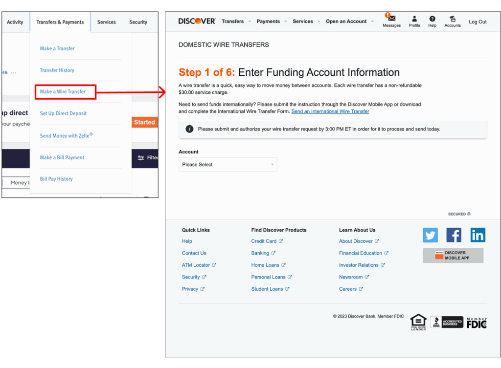
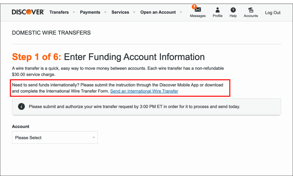
Currently, selecting ‘Make a wire transfer’ from the main navigation automatically directs users to the domestic transfer landing page. This is a significant gap in the user flow: there is no initial prompt for users to select the type of wire transfer (domestic or international).
The option for an international transfer is only mentioned within a small, easily overlooked paragraph on that page, instructing the user to either submit it through the Discover app or manually fill out a separate form. Our analysis of user behavior data suggested that approximately 60% of users who needed international transfers missed this paragraph entirely.
Cross-Platform Inconsistency Audit:
We also discovered significant inconsistencies between the app and web wire transfer flows that were creating confusion for users who accessed both platforms:
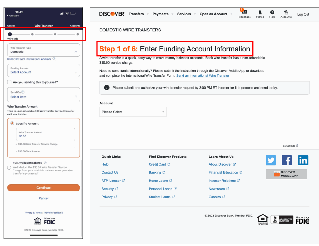
- The web experience had six steps, while the app had only four
- The headlines for each step were different
- The fields on each step were different, requiring users to re-learn the process
Why this matters: Users expect consistency across platforms. When the same task requires different mental models on web vs. mobile, it erodes trust and increases cognitive load.
To ensure a cohesive user journey, we decided to audit both flows and align the experiences, using the more efficient 4-step mobile flow as our benchmark.

The Redesign
Ideal Solution: Our primary recommendation was to prevent user confusion by implementing an initial decision screen that stops the automatic routing to the domestic flow and allows users to complete international wire transfers directly on the web.
Reality Check: However, technical limitations prevented this solution from being included in the current phase. The backend infrastructure for processing international wire transfers existed only in the mobile app, and rebuilding it for web would require 6+ months of engineering effort.
Strategic Pivot: Rather than delay the project, I worked with product and engineering teams to identify a solution that could ship quickly while still dramatically improving the user experience. This led to our web-to-app handoff approach.
Design Principles:
Future-proof
Design a foundation that could evolve to full web support
Minimize friction
Reduce steps and manual entry wherever possible
Maintain context
Users shouldn’t feel lost when transitioning platforms
Build trust
Provide transparency about costs and timelines
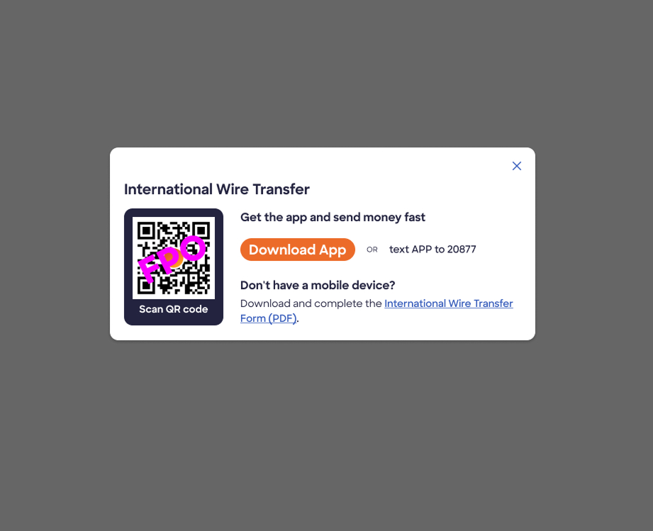
Working within the project limitations, we implemented an ‘International Wire Transfer’ link on the domestic landing page which triggers a callout. We presented two design options for this callout (a modal and an accordion) but ultimately recommended the modal approach.
Design Decision: Modal vs. Accordion
We favored the modal because its prominence significantly reduces the chance of users overlooking the redirection prompt. In stakeholder reviews, the modal received strong support for its ability to interrupt the automatic flow and force a conscious decision.
Why this matters: The accordion approach was more subtle and aligned better with existing patterns, but our concern was that users would scroll past it just as they had with the paragraph text. The modal ensures users can't proceed without acknowledging they're in the wrong flow.
Within the callout, we utilized a dual approach to direct users to the Discover app, prioritizing convenience:
- QR Code Option: Users can quickly scan to be taken directly to the correct app location
- Text Message Option: Users can receive a link to easily download or open the app on their phone
This dual approach accommodates different user preferences and contexts (desktop users vs. already on mobile).
Standardizing the Experience:
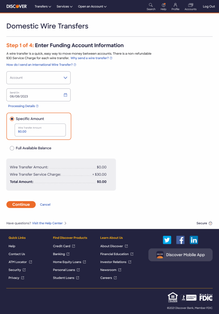
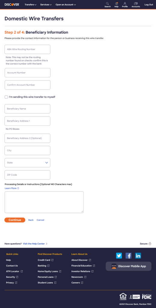
We audited the required data fields on both the physical international form and the digital domestic form. Since the amount and type of information were nearly identical, we were able to merge the experiences and simplify the total workflow from six steps to four.
Steps Consolidation:
- Before: Separate screens for recipient info, bank details, amount, review, confirmation, and additional details
- After: Combined related information into logical groupings, reducing navigation and improving completion rates
We also implemented smart field pre-population to enhance efficiency. For instance, after a user enters the required routing number, the associated bank name is automatically populated, minimizing manual entry and potential errors.
Why this matters: Every field a user must manually complete is an opportunity for errors and abandonment. Smart autofill respects the user's time and reduces friction in financial tasks that already carry stress.
Challenges & Solutions
Throughout this project, we navigated several significant constraints that required creative problem-solving:
| Challenge | Solution | Impact |
|---|---|---|
| Technical limitations prevented web-based international transfers | Designed seamless QR code + SMS handoff to mobile app | Maintained user momentum while working within technical constraints |
| Web (6 steps) vs App (4 steps) inconsistency confused users | Standardized both experiences to 4 steps with aligned terminology | Reduced cognitive load for cross-platform users |
| Users didn’t know international transfers existed | Implemented prominent modal callout at key decision point | Increased international transfer awareness and reduced support calls |
| Manual data entry increased errors and time | Added smart autofill (routing number → bank name) | Reduced completion time and error rates |
| Hidden fees caused user frustration | Created dynamic fee calculator showing real-time total cost | Increased transparency and trust |

Final Delivery
We successfully delivered a comprehensive redesign of the domestic and international wire transfer experience.
This effort reduced the process from six steps to four, creating a significantly faster and more efficient user flow. Additionally, we successfully implemented a seamless and intuitive web-to-app handoff for international transfers.
📲 Improving the International Transfer Handoff
Instead of using a simple paragraph to guide users to the international wire transfer physical form or app, we have implemented a more seamless handoff mechanism.
We introduced a pop-up modal featuring a QR code that directly links users to the appropriate location to either open or download the mobile app.
For further convenience, the modal also includes an option for users to receive a text message containing this same app link. This solution makes the transition to the mobile experience much smoother.
While the client opted to proceed with the QR code method for the app handoff, we had initially recommended implementing a dedicated decision screen. This proposed screen would have prevented user confusion by eliminating the automatic routing to the domestic transfer flow. However, due to technical limitations, we were unable to include this decision screen in the current phase of the project.
📊 Improving Clarity and Transparency
We removed redundant information and introduced a dynamic ‘checkout summary’ module at the bottom of the page.
This new module provides real-time transparency by mimicking a retail checkout experience. As the user enters their desired wire transfer amount, the module automatically calculates and displays the total cost, including the wire transfer fee.
Design Principle: Financial transparency builds trust. Users should never be surprised by fees at the final confirmation screen. By showing costs dynamically as they type, we reduce anxiety and prevent abandonment at the review stage.
✨ Enhanced Form Design: Faster Completion, Fewer Clicks
We successfully streamlined the process by merging the previous Steps 2 and 3 into one comprehensive step.
While this results in a longer view for that single step, it reduces the overall number of steps users must navigate—a net positive for completion rates.
Why this matters: Research shows that users prefer fewer navigation clicks over shorter forms. By consolidating related information into single screens, we reduced perceived complexity and improved flow.
Crucially, this consolidated step now includes powerful smart autofill features to accelerate data entry:
- Bank Information: Entering a routing number will automatically populate the “Bank Name” field
- Personal Information: Selecting the “I’m sending this wire transfer to myself” option will autofill basic personal details
These improvements ensure the form filling experience is significantly faster and prevents potential entry errors.
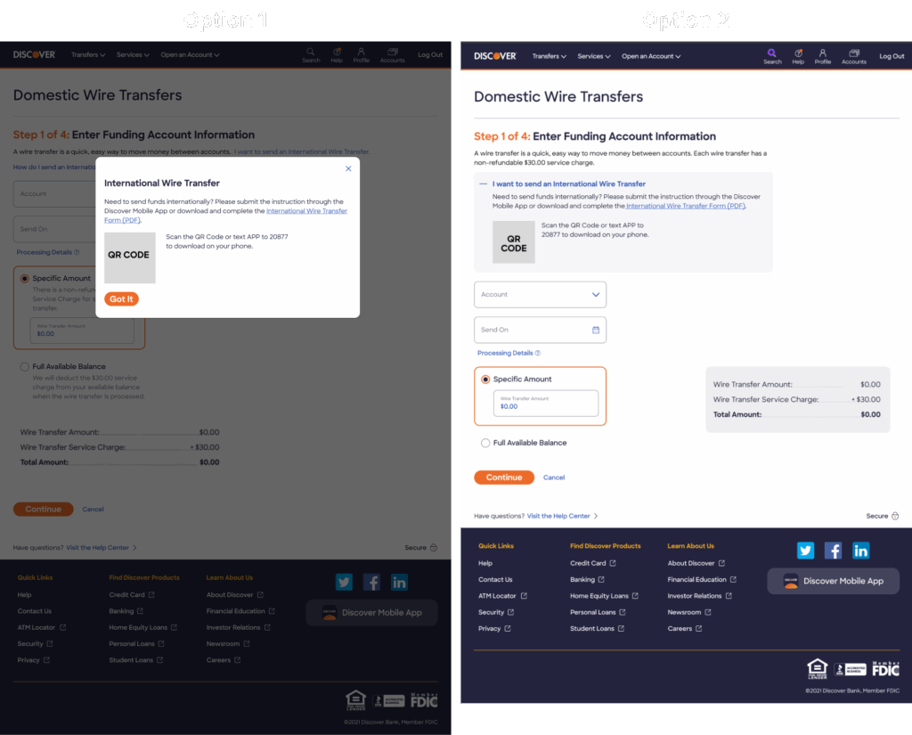
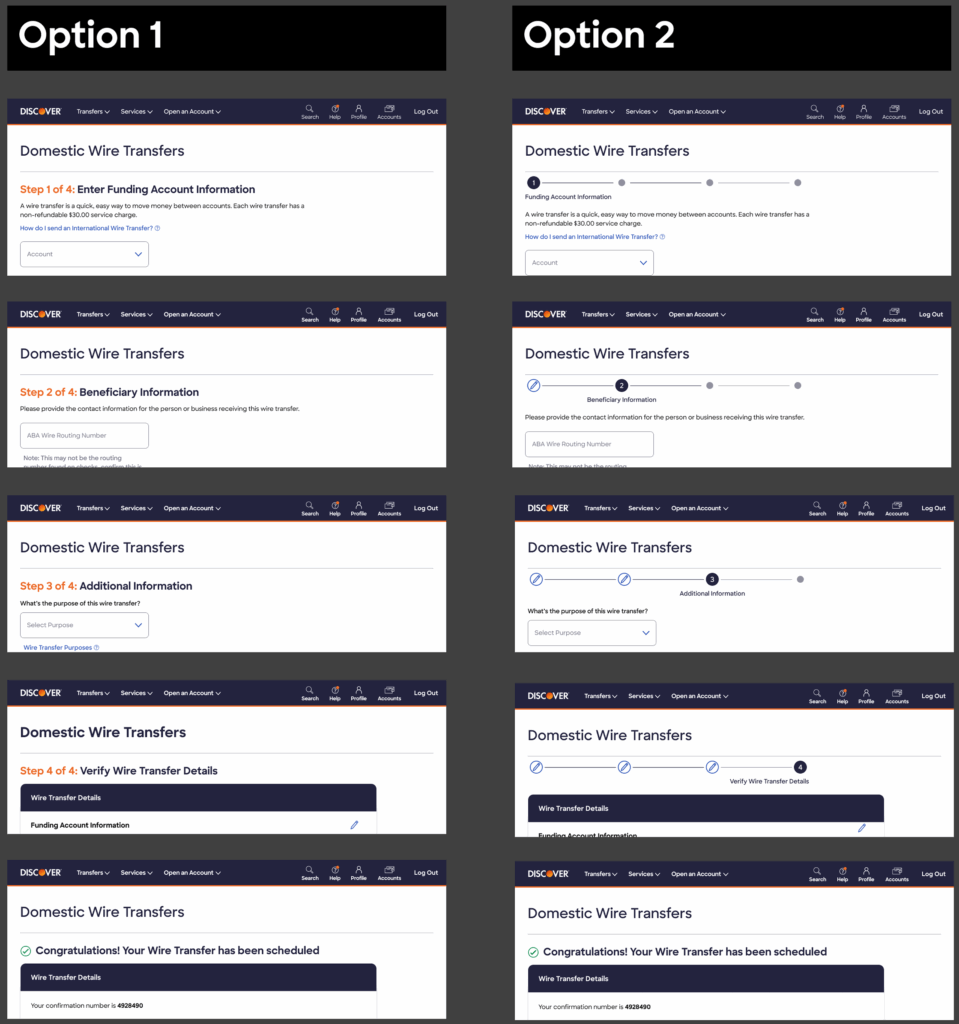
🎨 Progress Tracker Decision Summary
We presented the client with two distinct styling options for the page’s progress tracker.
Although Option 2 was better aligned with the app’s overall design language and provided a superior experience on mobile devices, the client ultimately selected Option 1 for the web version.
Stakeholder Rationale: The client’s preference was driven by Option 1’s enhanced visibility and clarity in communicating the user’s current position within the multi-step process. While Option 2 was more elegant, Option 1 performed better in usability testing for users who were less tech-savvy or completing wire transfers infrequently.
Trade-off Accepted: Sometimes the “better” design isn’t the right choice for your specific users and context. Option 1 prioritized clarity over elegance, which aligned with our core principle of building trust through transparency.
The Results: Our streamlined wire transfer experience delivered measurable business and user impact
📉 Operational Efficiency
- Decreased call center volume for wire transfer inquiries and support
- Reduced process from 6 steps to 4 — 33% efficiency improvement
- Standardized experience across platforms — Eliminated web vs. mobile confusion
- Reduced processing time for international transfers by eliminating physical form delays
✨ User Experience Improvements
- Simplified international transfer access with one-tap QR code and SMS handoff
- Eliminated data re-entry errors with smart autofill (routing number automatically populates bank name)
- Improved transparency with dynamic fee calculator showing real-time total cost
- Reduced cognitive load with consistent cross-platform terminology and flow
🎯 Long-term Impact
- Solution remains in production as of Winter 2025, demonstrating its sustainability and success
- Foundation for future payment experiences — The standardized 4-step flow became a template for other money movement features
- Model for web-to-app handoffs — The QR code + SMS approach was adopted by other product teams for cross-platform transitions